


Abstract
Air quality is an important public health issue. Because it varies across multiple dimensions and multiple dynamics of exposure, controling and measuring the impact of air quality on people is a tricky, and therefore often overlooked, subject. Amid sanitary protocol sparked by the Covid-19 pandemic, we tested the efficacy of electronic noses for the fine control of air confinement in public schools. A web application was deployed to track air quality variation and monitor people exposure to confined and polluted air. The experiment demonstrated that online air quality monitoring is more efficient for the management of air confinement than strict offline guidelines.
During my time as a R&D engineer at Ellona, I was leading a project to demonstrate the value of online monitoring for air quality management in schools.
In the aftermath of Covid-19 lockdown in France, the french ministry for education had set up a sanitary protocol for air confinement control in classrooms. Proper air renewal is indeed an important parameter to reduce propagation of airborne pathogens such as respiratory viruses (see here for extended litterature).
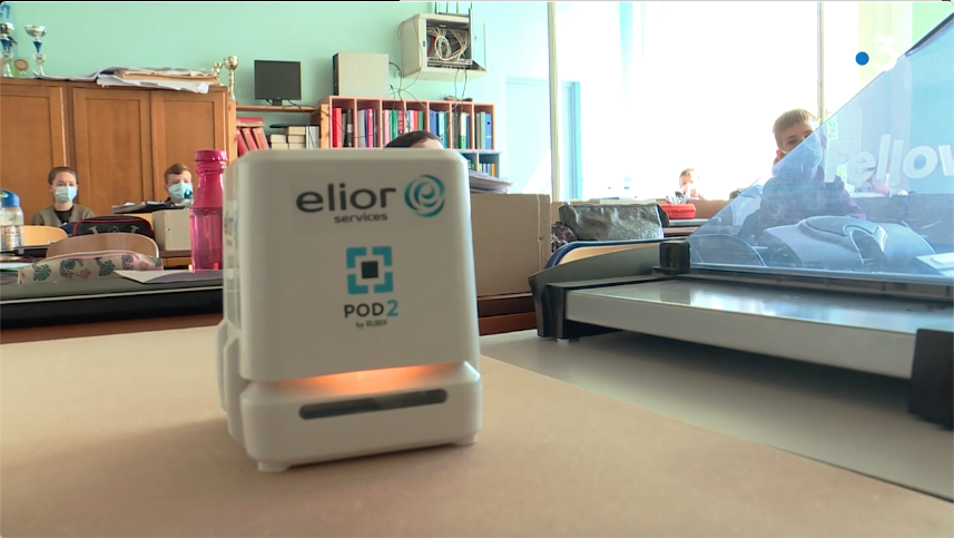
Ellona teamed up with Elior Service to experiment how the use of POD2 air quality sensors could improve air quality control in the classroom, and more generally, in densely occupied spaces. This collaboration was featured in the french news.
Results of the experiment showed that online monitoring of air confinement was more efficient than a strict protocol for air renewal, and caused less inconvenience for teacher and students.
The problem
Section titled [object Undefined]The sanitary protocol in effect in French public school in 2021 was lacking in several aspects:
- It was suboptimal, as it did not take into account environmental parameters or class occupancy to adjust ventilation requirements.
- It was quite simplistic, reducing air quality to the confinement dimension, discarding other relevant parameters such as concentrations in nitrogen dioxyde or particulate matters.
- It was quite inconvenient in winter time.
- It put an important additional burden on teachers, especially as it changed fast with new recommandations of the scientific council issued.
- It did not include any plan to evaluate its efficacy for air confinement and air quality management.
The solution
Section titled [object Undefined]The solution combined Ellona’s hardware POD2, an air sensing unit measuring various relevant indicators of air quality (CO2, NO2, particulate matter), and a software component to query, process and visualize the data.
The design of the solution was pretty simple: when CO2 level crosses a threshold, the device LED blinks red to signal the room needs air renewal. Opening the window brings fresh outside air, which is assumed to be cleaner (more on that below), and make CO2 concentration drop.
We sought to demonstrate that adapting air renewal to room occupancy and atmospheric conditions, rather than following a fixed pattern of window opening, would allow better overall control of air quality, and minimize inconvenience of frequent opening of windows in winter time. Moreover, we would leverage the capacity of the POD2 to measure additional relevant markers of air quality, to provide a more complete pictures of indoor air quality.
We quickly realized that the visualization solutions included in Ellona’s standard data analytics suite were not adapted to allow the teacher to follow the evolution of air quality as she applied the above protocol.
A webapp to extract air quality indicators from sensor data
Section titled [object Undefined]To this end, we designed a web application allowing online monitoring of classroom air quality during school days. Data processing methods and visualization bricks were selected to answer two questions:
- Do air confinement levels comply with recommendations of the French High Council for Public Health ?
- Does air pollution decrease or increase upon air renewal ?
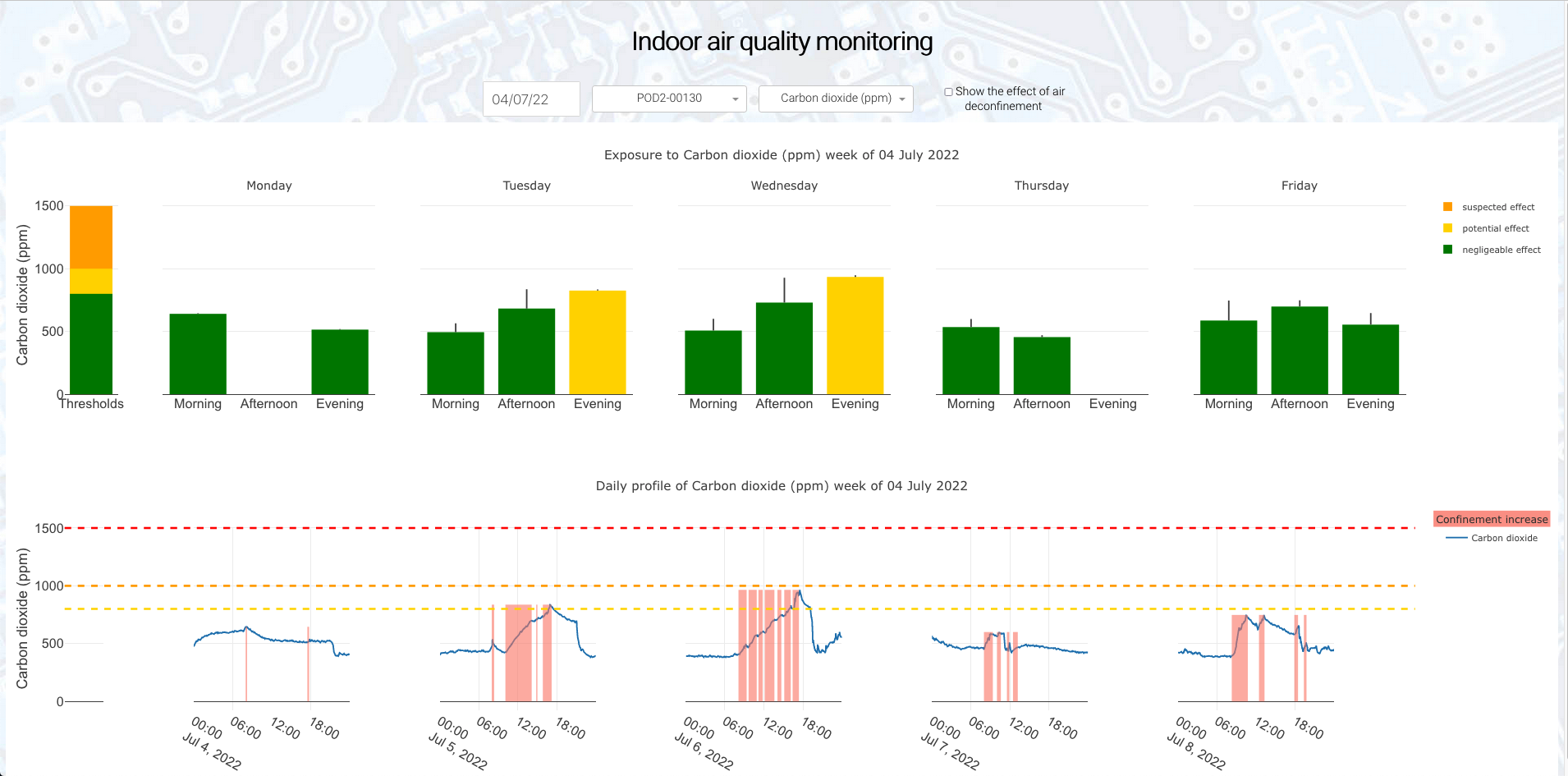
The dashboard comprises two sections:
- a top panel showing the average (barplot) and max (error bar) exposure to a given pollutant, broken down by school day. Exposure levels are color-coded according to reference air quality and confinement guidelines.
(DISCLAIMER: Calculating actual exposure to atmospheric pollution is complex and requires the integration of several parameters far beyond the experimental setup described here: these thresholds are merely indicative and by no means represent a certified measure of health-impacting exposure).
- a bottom panel showing the actual trend of the parameter over day, with periods of air confinement increase (i.e., students attending in the room) highlighted.
This layout makes it possible to assess the cumulated exposure on a given day, see it evolving in real time, and compare it with the rest of the week.
Example on toy data
Section titled [object Undefined]In the toy example (using non-sensitive data) below, virtually no people were detected in the room on Monday, according to CO2 trend measured by the air sensor.
Moreover, the level of air confinement is acceptable throughout the week:
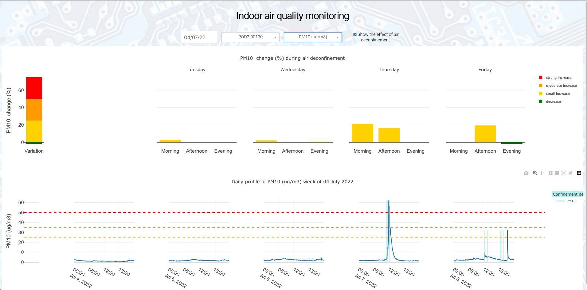
When ticking the « air deconfinement » checkbox, user can inspect the effect of air deconfinement (i.e., students going to playground or the professor opening the windows) on air quality parameters. Periods of air deconfinement (that is, significant drop in CO2 concentration) are highlighted in blue:
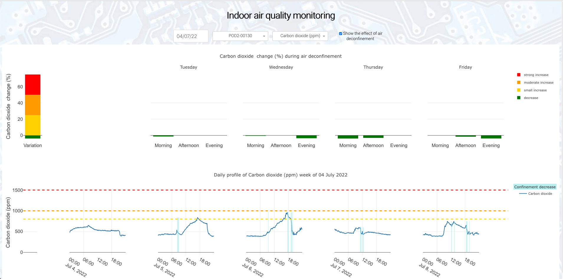
This allows to check that no significant additional pollution is imported from outside when ventilating the room. In the toy example below, one can see a PM10 pollution event during room ventilation on thursday and friday afternoon:
Technological stack
Section titled [object Undefined]The application was written purely in Python, with Dash.
Under the hood, it leverages Ellona’s API for authentication and sensor data queries, custom data processing methods to compute confinement and deconfinement windows, and StatsPlot, my library for easy interactive statistical plots in Plotly.
Picking a date in the calendar queries data of all devices in the user scope for the corresponding week. Dash app being stateless, the data is serialized and stored on client side to be shared by the two plot callbacks.
Adopting a pure Python framework made it easy to reuse our in-house data analysis toolbox, essentially just wrapping it with our callback functions.
The resulting webapp was deployed via Docker on a third party provider. Application-level parameters (such as language, slope thresholds, etc) are supplied as environment variables, which can be easily set via the Dockerfile.
The choice of this framework allowed us to design and iterate fast over the 3 months duration of the project. This experimentation later inspired the development of the dashboard feature on Ellona’s main analytics platform.
A demo app demonstrating the dashboard on toy data can be found at this address.
Further readings
Section titled [object Undefined]COVID-19 Indoor Safety Guideline: An app to compute appropriate conservatory measures (room volume, people occupancy…) to limit the risk of respiratory virus propagation
Indoor air quality guidelines by ANSES, the health and food french administration